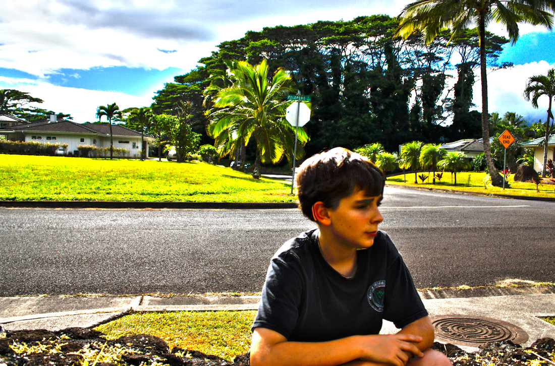
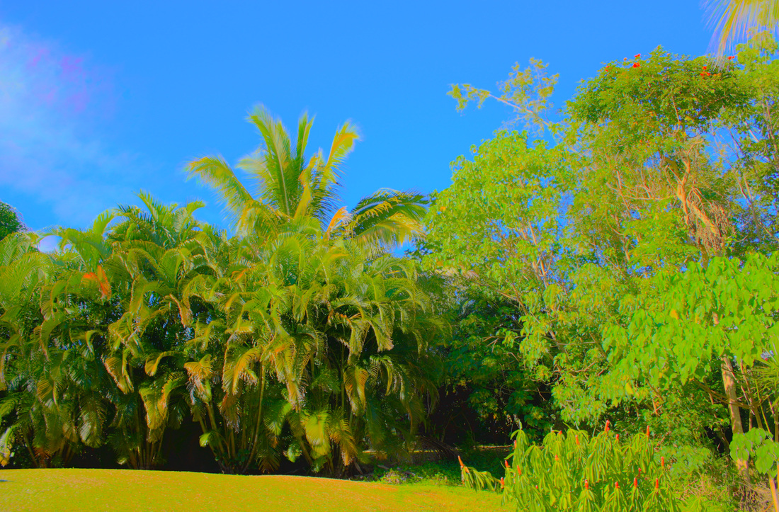
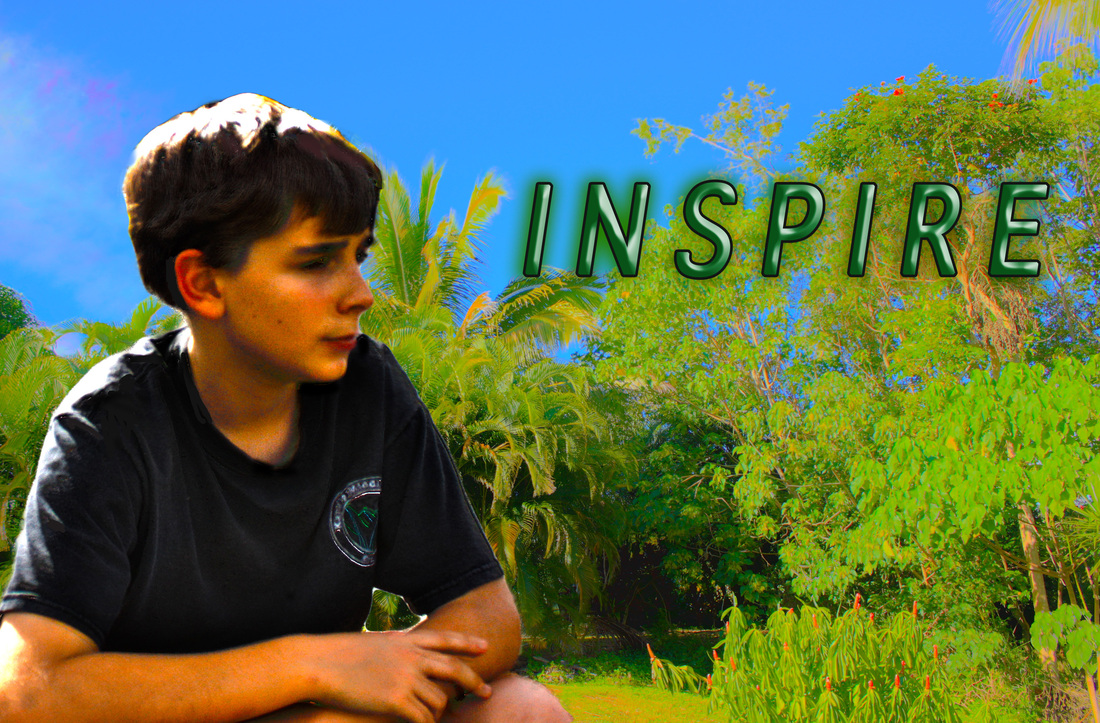
| In GT we are doing a new project called double exposed portraits, it involves a lot of specific directions but you still have a lot of room to make it represent you. I have to admit that this seems like one of the hardest projects we have so far. Portrait photography is a photo of a person or of a group of people. It shows personality, expression, and it is usually focused on the persons face. Portrait can relate to a profile view and silhouetting because they are all pictures, obviously, but a profile and a silhouette are types of pictures that can be used in a portrait. A profile is when you can only see half on the persons face, which is the outline, like the nose and lips, but you can also only see one eye. A silhouette is a image that you only see a solid color, usually black, of a person, animal, or object. To create a double exposed portrait, you need 3 photos. One profile photo of one side of your face, and 2 other photos that symbolize you. Then you open up photoshop and you go File>Scripts>Load Files Into Stack. I have a picture of it on the right. Then you go and select your photos that you want to use. Once you've selected your photos and they are all loaded in photoshop, you use the dodge tool and you make the background white of as close to white as you can. Once you've done that, you double click on every layer and change it to 'screen', which lets you see through the photos. Then you add layer effects by going Layer>New Adjustment Layer then choose which one you want. I think that a lot of people would like to make one because you can really personalize it and make it represent you. In my first double exposure (the one that is green), my two symbolic pictures are of plants and grass. I had trouble with making it in photoshop because I was really trying to make it not look as green and make the colors a little more surreal. In my next and final double exposure, my two symbolic pictures are of my favorite book (Harry Potter), and of sheet music because I like to play piano. I really think that I should've chosen a color besides brown and white, but I spent a lot of time on colors and it definitely looked the best out of the many other colors that I tried to use. I also wish that the words of the book extended to all the way down to the bottom of my shoulders, but I did not have enough time to place it because the bell rang. The 2 adjustment layers that I used were the gradient map and curves. I first used the gradient map and found a very nice brown/white gradient that seemed to look by far better than the other colors I tried. But the only downside was that it also made the background a light brown. So then I go to curves and I adjusted it little by little until it turned the background white. 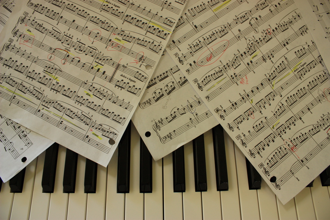 My first symbolic image. (In my double exposed portrait you can't see the piano keys.) 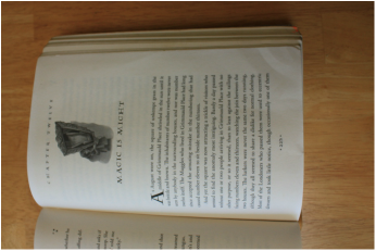 My second symbolic image. | 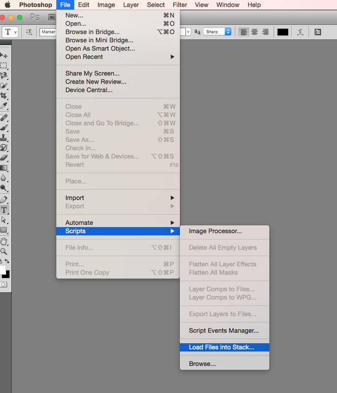 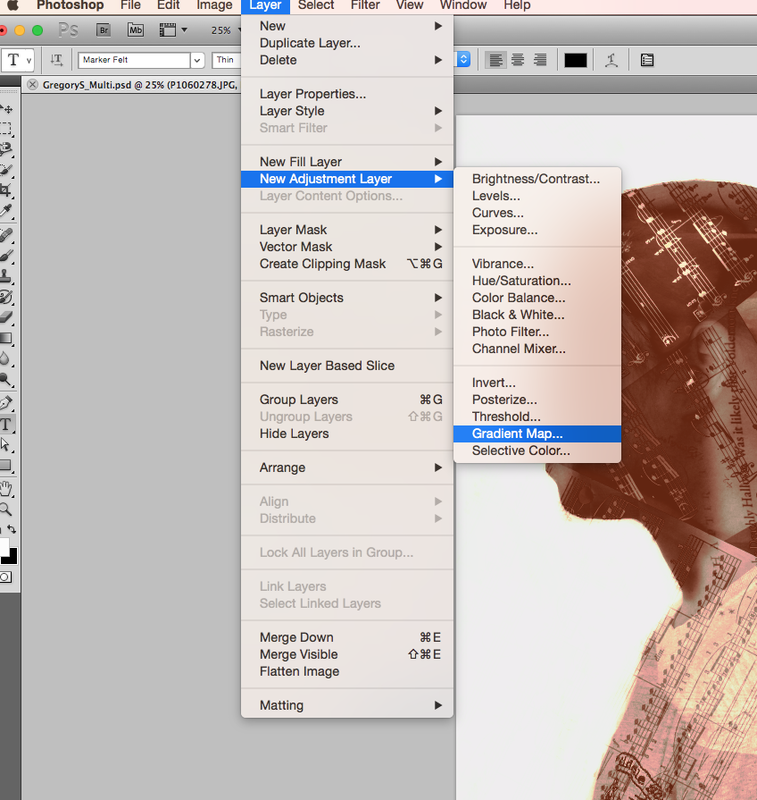 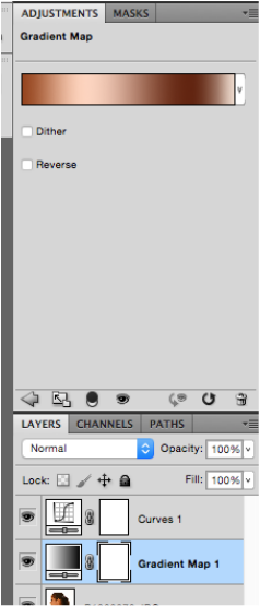  |
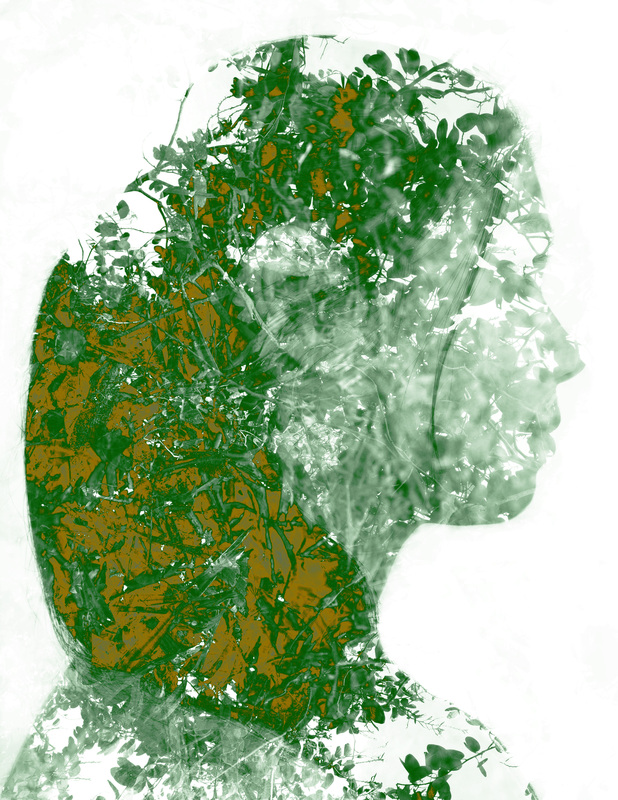
My practice photo.
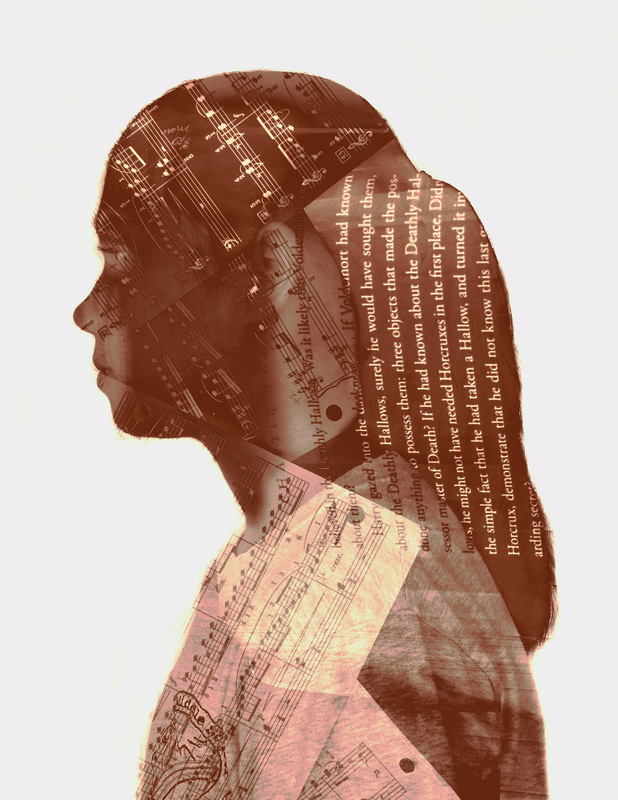
My finished and final Double Exposed Portrait!!